Case study · 2026
Harbor Coffee Roasters: an identity that survived the move to retail
A specialty roaster outgrowing its first logo. New identity, a packaging system for 30 origins and a shop that doubled online sales in a year.
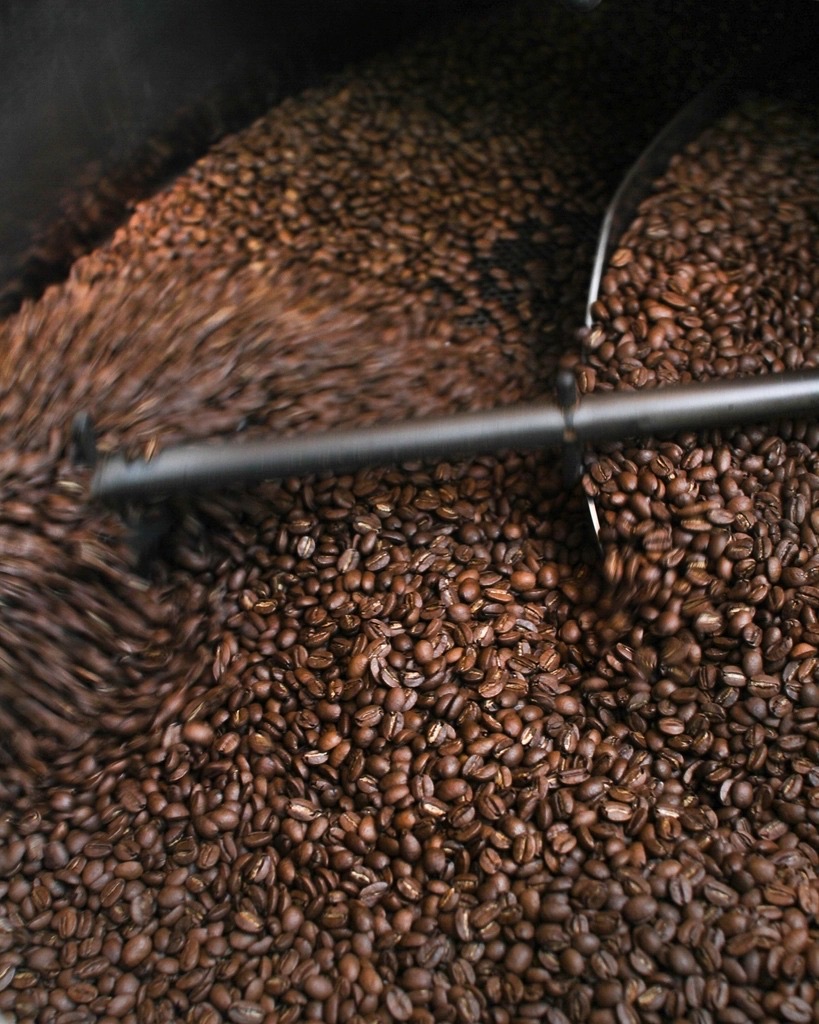
Harbor had been roasting for six years when supermarkets started asking for their beans. The logo, drawn by a friend in 2016, worked on a café window and fell apart on a shelf.
The problem
Thirty origins, four roast profiles, seasonal releases every month, and a two-person team updating labels by hand. The brand needed a system, not a mark.
What we did
A wordmark built from a single heavy grotesk, a colour-coded origin system that a roaster can apply without a designer, and a label template that prints on the shop's existing machine. We then designed and built the online shop around subscriptions.
Result
Online revenue doubled in the first year. The in-house team has released 40 labels since launch without sending us a single file.